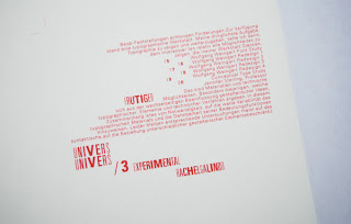
I stumbled upon Univers Font Study. I tried to figure out exactly what it was all about, but I had a problem finding a story behind it... maybe there isn't one... nonetheless, I thought these images of typography were really fun.
I really like the way they make univers look as though it's wrapping around a cylinder
Cool, right?
These are not all of the images from this project (shown are my favs), so I hope I'm not ruining some of the concept by only showing a few, but to see the whole group go here
Then I found this idea that I really like...Sustainable Fonts
?
Fonts that use less ink=money savings!
After reading more the conclusion is that Century Gothic is the winner.
and then I found this...
It's called ecofont
Basically, you have your typed document, change the font to eco font, print your document, and these little holes are "shot" in the letters to save up to 25% ink. (That's quite a bit considering a gallon of printer ink costs roughly 10,000) The holes are too small for you to see, and they do not effect legibility.
It can adapt to any font you choose
A Few Ideas:
1. Some say that Century Gothic may not be the best of all for the reason that it takes up more paper space, thus not being sustainable. Agreed, but maybe just print in a smaller font size?
2. If that doesn't work for you (it's already too hard to read the screen), you can try Georgia(current font), which is much easier to read at a smaller font that default Times New Roman.
3. Another that works well sized down is Bell Centennial
4. Try printing in draft mode for lighter printing
Okay, that's all for now
Thanks for reading!
Your Doll,
M


1 comment:
Ok so I have to tell you that just the other day I was in this store, called Paper Source, & I saw this book all about fonts. It was fascinating! I love the second & third picture here...it's a cool effect! I have never heard of sustainable fonts...I guess it only makes sense if the use less ink though. It is a good idea :-) Thank you for sharing!
oh & love that pic of u at the end too!
peace & love,
Lindsey
http://designdolci.blogspot.com/
Post a Comment